Universidade Fernando Pessoa
Porto, Portugal
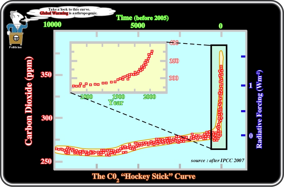
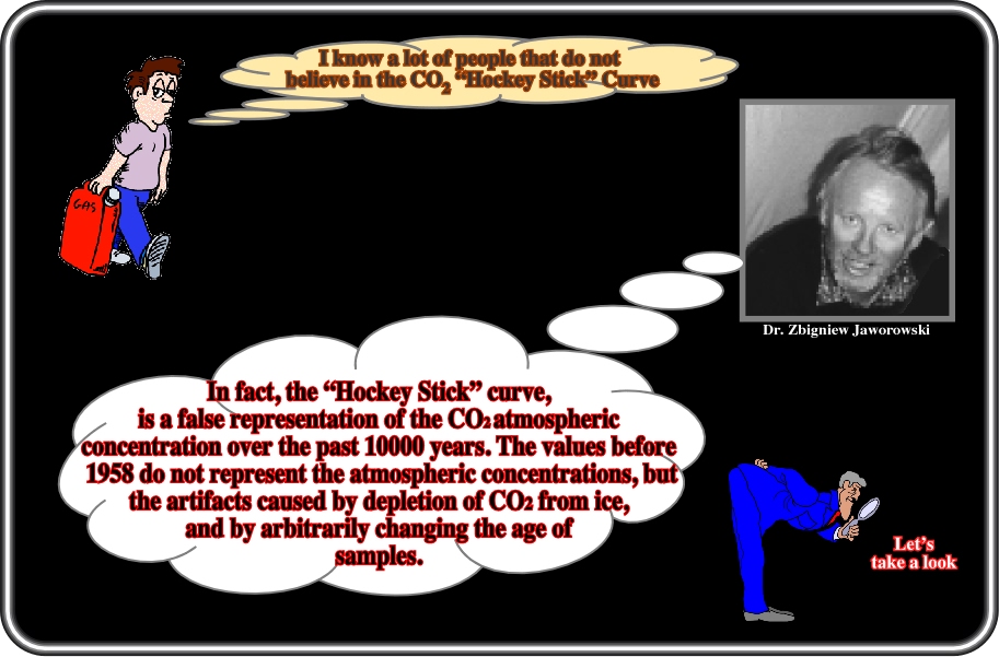
Plate 34- The Intergovernmental Panel on Climate Change’s (IPCC) Third Assessment Report concluded "it is likely that the rate and duration of the warming of the 20th century is larger than any other time during the last 1000 years. The 1990's are likely to have been the warmest decade of the millennium in the Northern Hemisphere, and 1998 is likely to have been the warmest year." The primary basis for this assertion was a climate reconstruction that produced the so-called "Hockey Stick Curve", which shows that the 20th century was unusually warm compared to preceding centuries. As we can see above, such a curve strongly suggests that: (i) The amount of CO2 in the atmosphere was more or less stable (± 260-280 ppm) until the last century; (ii) Then, abruptly became ± 360 ppm (see horizontal time scale on the top); (iii) Such a change corresponds to a sharp increase of more or less 30%. This curve is used by all "Alarmists" to associate the global warming (the average mean temperature did not rise after 2000) with human activity, in spite of the fact that the CO2 represents just 0.037% of the volume of the atmosphere. However, a lot of scientists consider the "Hockey Stick Curve" as fictional. McIntyre and McKitrick (http://www.marshall. org/article.php?id=188), for instance, examined its construction and the data set of proxies for past climate (used to estimate the temperature record from 1400 to 1980). Their review found four categories of error: (i) Collation errors; (ii) Unjustified truncation and extrapolation; (iii) Use of obsolete data and (iii) calculation mistakes. After correcting for these errors, they found that the temperature for the early 15th century was actually higher than that of the 20th century. Thus, McIntyre-McKitrick findings challenge one of the most influential aspects of the climate change debate, i.e., the "Hockey Stick Curve", which has been accepted as fact by the international community and many domestic interests pushing the Kyoto Protocol. Characteristically, the "Alarmists" reacted to all scientific arguments refuting their fallacious curve by a bunch of metaphysical arguments (not testable) as we can find out taking a look at the following internet site: http://www.realclimate.org /index.php/archives/2004/12/ myths-vs-fact-regarding-the-hockey-stick/.
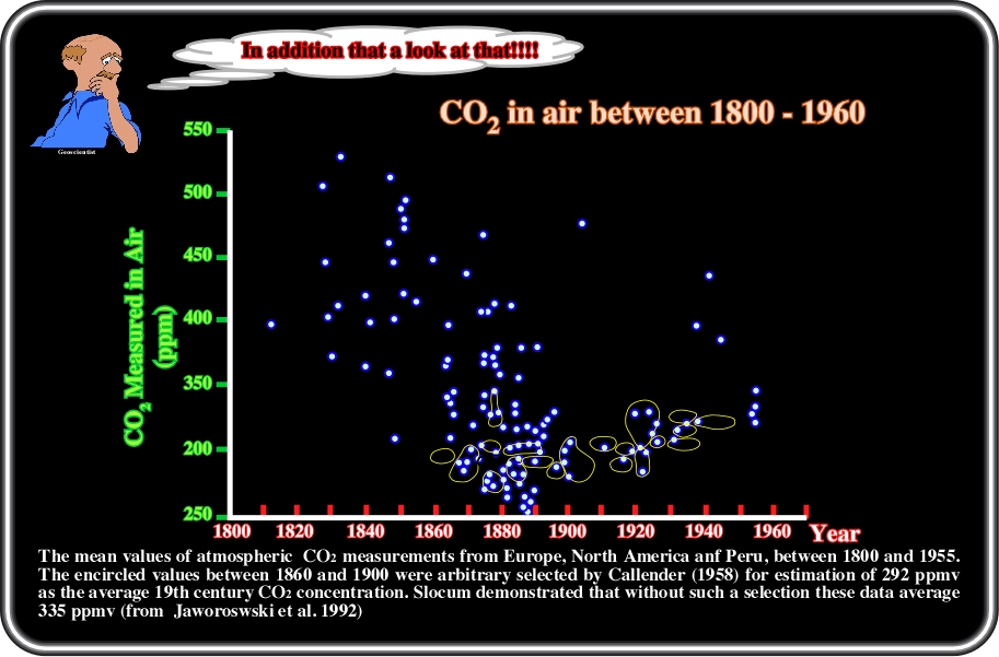
Plate 35- The "Hockey Stick Curve" has been severally criticized. Z. Jaworoski (http://www.larouchepub.com/eiw/public/ 2007/2007_10-19/2007-11/pdf/38_711_science.pdf), on this subject, wrote: "On the basis of assumption piled upon assumption, several versions of CO2 “hockey stick curves” were compiled, by combining the distorted proxy ice core data and the recent direct atmospheric CO2 measurements. The authors of such curves claimed that their curves represent the atmospheric CO2 levels during the past 300 years (Neftel et al. 1985, Pear man et al. 1986, Siegenthaler and Oeschger 1987), or the past 10 ky, or even the past 400 ky (Wolff 2003). They all show low pre industrial CO2 concentrations, ranging from about 180 to 280 ppm during the past 400 ky, and soaring up to about 370 ppm at the end of the 20th century. These so-called hockey stick curves were published countless times as a proof of the anthropogenic increase of CO2 in the atmosphere. They were created by illegitimately mixing the false proxy ice core data in the atmosphere. However, the worst manipulation was the arbitrary changing of the age of the gas trapped in the upper part of the core, where the pressure changes were less drastic than in the deeper parts. In this part of the core, taken from Siple, Antarctica, the ice was deposited in the year 1890, and the CO2 concentration in it was 328 ppm (Friedli et al. 1986, Neftel et al. 1985), and not the 290 ppm needed to prove the man-made warming hypothesis. The same CO2 concentration of 328 ppm was measured in the air collected directly from the atmosphere at the Mauna Loa volcano, Hawaii, 83 years later, in 1973 (Boden et al. 1990). So, it is shockingly clear that the pre-industrial level of CO2 was the same as in the second half of the 20th century. To solve this “problem,” these researchers simply made an ad hoc assumption: The age of the gas recovered from 1 to 10 grams of ice was arbitrarily decreed to be exactly 83 years younger than the ice in which it was trapped! Any experimental evidence did not support this, but only by assumptions, which were in conflict with the facts (Jaworowski 1994a, Jaworowski et al. 1992b). The “corrected” proxy ice data were then smoothly aligned with the direct atmospheric measurements from Mauna Loa".
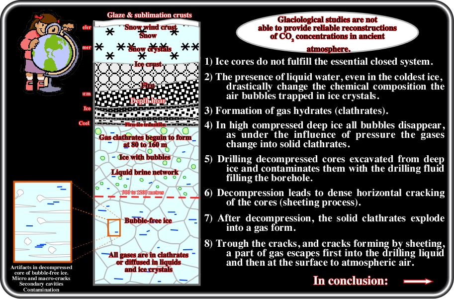
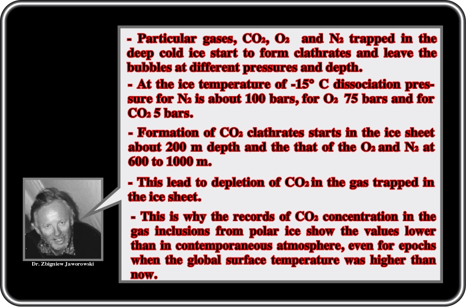
Plate 36- According to Z. Jaworoski (http://www.larouchepub.com/eiw/public/2007/2007_10-19/2007-11/pdf/38_711_science.pdf), the four basic IPCC lies (see report 2007) are: (i) CO2, the most important anthropogenic greenhouse gas, increased markedly as a result of human activities, and its atmospheric concentration of 379 ppm (parts per million, by volume), in 2005, by far exceeded the natural range of 180 to 300 ppm over the last 650 ky; (ii) Since 1750, human activities warmed the climate; (iii) The warmth of the last half-century is unusual, is the highest in at least the past 1.3 ky, and is very likely caused by increases in anthropogenic greenhouse gas concentrations; (iv) Predictions are made that anthropogenic warming will continue for centuries, and between 2000 and 2099 the global average surface temperature will increase 1.1°C to 6.4°C. The "Hockey Stick curve" is mainly based on the assumption that CO2 ice core records are regarded as a foundation of the man-made global warming hypothesis. Here again, there are four arbitrary assumptions behind the CO2 glaciology which were used to support such conjecture: (a) No liquid phase occurs in the ice at a mean annual temperature of −24°C or less (Berner et al. 1977, Friedli et al. 1986, Raynaud and Barnola 1985); (b) The entrapment of air in ice is a mechanical process with no differentiation of gas components (Oeschger et al. 1985); (c) The original atmospheric air composition in the gas inclusions is preserved indefinitely (Oeschger et al. 1985); (d) The age of gases in the air bubbles is much younger than the age of the ice in which they are entrapped (Oeschger et al. 1985), the age difference ranging from several tens to several ten-thousands of years. Jaworowski, more than a decade ago, demonstrated that these four basic assumptions are invalid. Ice cores cannot be regarded as a closed system and low pre-industrial concentrations of CO2 as well as other trace greenhouse gases, are an artefact, caused by more than 20 physical-chemical processes operating in situ in the polar snow and ice, and in the ice cores.
Plate 37- Not everybody agrees with Z. Jaworowski, particularly those who are directly or indirectly involved with IPCC. Let's remind what Hans Oeschger (Bern University, Switzerland), who was a Lead Author of the First Assessment Report of the IPCC, said on this subject: "The teams of researchers involved in ice core studies have a high standing within the scientific community. The early increases of the greenhouse gases are used to initiative the models simulating climatic change and help to understand the source and sink problem related to the greenhouse gas increases of the last 150 years. The low glacial greenhouse concentrations are an essential boundary condition for climate modelling experiments of the Earth during a glacial period. The science community does, not take the papers by Jaworowski, and the one by Heyke quoted in this paper, seriously. The problem with these publications is that a broader circle of persons interested in the Global Change issue will receive the impression that the assessment of the problem is partly based on doubtful information, that there are serious weaknesses in experimental procedures, that the whole Global Change problem does not need to be taken so seriously and that there is no urgency regarding the control of CO2 emission. The time lost now is crucial for attempts to limit the anthropogenic climatic change to a range with more absorbable negative consequences. The study of the history of Earth system parameters is an on-going process; an increasing number of laboratories have become involved and interact with each other. As it is the case in any field of science, the state of art is continuously critically assessed and attempts are made to improve the quality of the research. Ice-core information is fundamental for the assessment of one of the most urgent problems of our time. Based on my experience during decades of involvement in this field, I consider the chances as very small that the major findings from greenhouse gas studies on ice cores are fundamentally wrong; and I find the publications of Jaworoski not only to be incorrect, but irresponsible (http://www.someareboojums.org/blog/?p=12)". In spite of the aggressive comments of Profs. H. Oeschger (the first to measure the glacial-interglacial change of atmospheric CO2, showing (1979) that the atmospheric concentration of CO2 during the glacial was almost 50% lower than today), a lot of scientific studies have been done, in several well-known Universities, showing that all results of Profs. Oeschger on the ice-core cannot be trusted (see next).
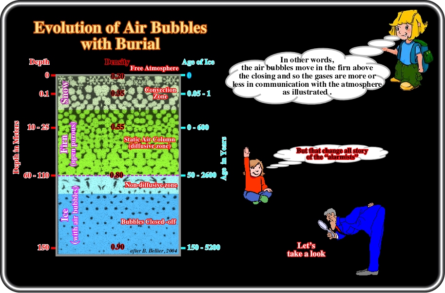
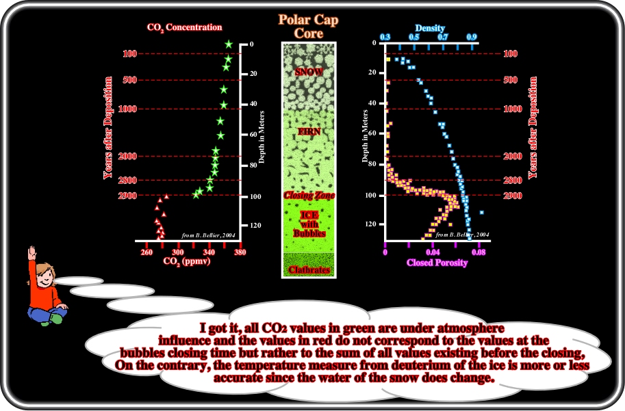
Plate 38- In surface, snow has a density of ±0.3. In depth, snow is progressively packaged and its density became ±0.83 when the air bubbles are closed-off at depths ranging between 20 and 150 meters. Claude Lorius, a French glaciologist director of the Laboratory of Glaciology and Geophysics of Environment, in Grenoble, and currently emeritus director of research at CNRS, had the idea to study the gases contained in the air bubbles of the Vostok (Antarctic) ice-cores. Such a study has allowed us to obtain the story of the greenhouse effect gases used in the global warming. However, in the majority of the published papers, the problem of the dating the air bubbles was, and still is, forgotten. If the dating the ice is quite easy when the annual variations are well visible, when they disappear, hypotheses on the packing, accumulation and calibration (volcanic eruption or cosmogenic measures) are required. The datings of the ice are polluted as well as the deducted temperatures determined from the isotopic variations of the hydrogen or oxygen of the water. On the other hand, the air bubbles move in the snow above the closed-off zone and the gases are in constant communication with the atmosphere. During all opening period of the bubbles, which can be more than 5000 years, there is aggregation by convection, diffusion and gravitation of the atmospheric gases for all that period, which induces a smoothing effect (an average) over several millenniums. It is such a smoothing that explains the flat results of the CO2 measures in the ice cores when compared with other temperature proxies as the stomates (a tiny opening or pore that is used for gas exchange and formed by a pair of specialized cells known as guard cells which are responsible for regulating the size of the opening and found mostly on the epidermis of plant leaves). Proclaiming that the ice results are stables and accurate is to neglect how Nature works and how the data was archived.
Plate 39- The graphs of B. Bellier (Étude des variations du cycle du carbone au cours de l'Holocène à partir de l'analyse couplée CO2-CH4 piégés dans les glaces polaires. Laboratoire de glaciologie et de géophysique de l'environnement, Université Joseph Fourier-Grenoble 1, Spécialité : Sciences de la Terre et de l'Univers, Grenoble, 2004) depicted above, show the CO2 values range between those of the non-closed bubbles (draw in green) and those of closed bubbles (in red) and that there is a significant gap between such values, since after the closing of the bubbles, the influence of the atmosphere of the precedent epochs is meaningless. In addition, the red values (those of the closed bubbles) do not correspond to closing time of the bubbles, which here is around 2900 years ago. They correspond rather to the aggregation of all values of the CO2 during 2900 years. Finding an aggregation value is not simple. It is better speak in terms of average age and maximum age corresponding to the closing off of the bubbles. The jump from 280 to 320 ppm of CO2 clearly underlines that there is discontinuity and complexity. It is quite evident that we should avoid speaking of gas content at a certain age, but rather of an average of gas content existing at a certain time period (with an associated uncertainty of several millenniums). In addition, the greater the depth of an ice-core, then the greater is the compaction of the ice, that is to say, that a core of ±50 cm long (minimum necessary to measure the gases concentrations) corresponds more or less to a millennium. In other words, there is a smoothing in the age of the snow and also in the sampling of the bubbles. The depth of the closing off of the bubbles changes as a function of the accumulation rate of the snow and temperature. The annual accumulation rate also changes quite a lot. It is ± 2 cm per year, in Vostok, and it is ± 50 cm/y on the margins of the continent. In Vostok area, it seems that there is an accordance between the published accumulation rates of snow and the depth of the closing off of the bubbles, but there is a strong disagreement on the age of the closing off of the bubbles (i.e. the datings of the ice and bubbles which are estimated using mathematics models).
Plate 40- Certain authors (verificationists) have a tendency to avoid values that do not fit their hypotheses. They consider them as artefacts. They just take into account the values which corroborate their hypotheses. Such an attitude is contrary to the scientific procedures followed by the majority of scientists, who aggressively test (criticize) their hypotheses in order to determine their degree of fallibility. When one or several features refute the initial hypothesis, they advance another hypothesis or conjecture. They do not try to change the data to confirm the original hypothesis. In its turn, the new advanced hypothesis is submitted to new tests, and so on. Science progresses through trial and errors. Jaworowski listed a large number of CO2 measures made in the past in the atmosphere by a large number of scientists (even Nobel Prize Winners) and he found that certain criteria have not been taken into account in the majority of recent published papers. The authors consider them as artefacts without any justification, which scientifically speaking is arbitrary and forbidden. On this subject, Jaworowski wrote: "Improper manipulation of data, and arbitrary rejection of readings that do not fit the pre-conceived idea on man-made global warming is common in many glaciological studies of greenhouse gases. In peer reviewed publications, I exposed this misuse of science. Unfortunately, such misuse is not limited to individual publications, but also appears in documents of national and international organizations. IPCC not only based its reports on a falsified “Siple curve”, but also in its 2001 report used as a flagship the “Hockey Stick Curve” of temperature, showing that there was no Medieval Warming, and no Little Ice Age, and that the 20th century was unusually warm. The curve was credulously accepted after Mann et al. paper published it in Nature magazine. In a crushing criticism, two independent groups of scientists from disciplines other than climatology (i.e. not supported from the annual pool of many billion “climatic” dollars), convincingly blamed the Mann et al. paper for the improper manipulation and arbitrary rejections of data. The question arises, how such a methodically poor paper, contradicting hundreds of excellent studies that demonstrated the existence of global range Medieval Warming and Little Ice Age, could pass the peer review for Nature? And how could it pass the reviewing process at the IPCC? The apparent scientific weaknesses of IPCC and its lack of impartiality, was diagnosed and criticized in the early 1990s in Nature editorials. The disease, seems to be persistent". And he concluded: "The basis of most of the IPCC conclusions on anthropogenic causes and on projections of climatic change is the assumption of a low level of CO2 in the pre-industrial atmosphere. This assumption, based on glaciological studies, is false. Therefore IPCC projections should not be used for national and global economic planning. President G. W. Bush correctly defined the climatically inefficient and economically disastrous Kyoto Protocol, based on IPCC projections, as “fatally flawed”. The President of Russia V. Putin recently followed this criticism. I hope that their rational views might save the world from enormous damage that could be induced by implementing recommendations based on distorted science" (http://www. warwickhughes.com/icecore/). Admittedly, certain old measurements are doubtful, but those made in the ice-cores are also, as well as the measures issues from the stomates of the fossil plants.
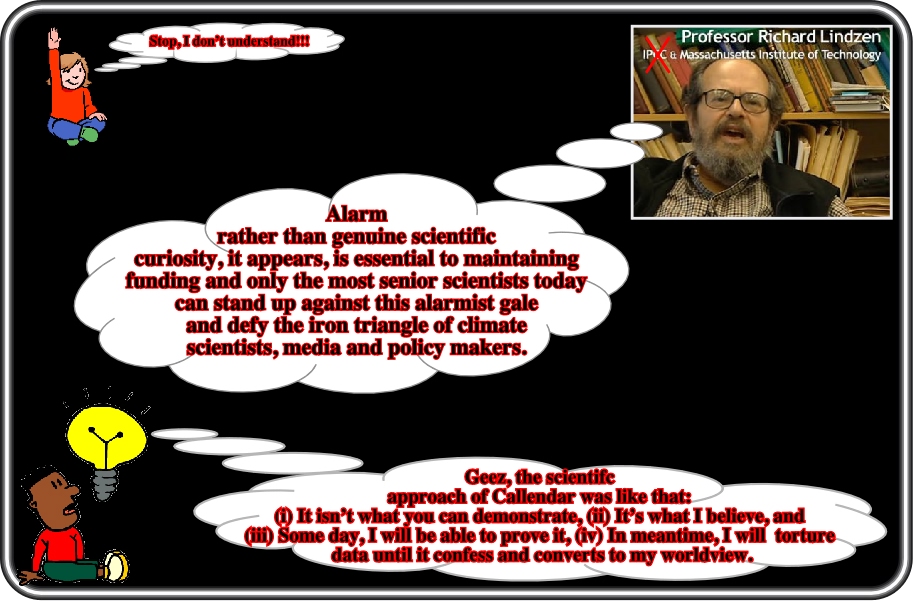
Plate 41- Richard Siegmund Lindzen is a Harvard trained atmospheric physicist and the Alfred P. Sloan Professor of Meteorology at the Massachusetts Institute of Technology. He is known for his research in dynamic meteorology, especially planetary waves. He has published over 200 books and scientific papers. He was the lead author of Chapter 7 of the Third Assessment Report of the IPCC on global warming (2001). Profs. Lindzen, as an honourable and independent scientist, left the IPCC organization. In an article (Wall Street Journal, June 11, 2001), he stated that "There is no consensus, unanimous or otherwise, about long-term climate trends and what causes them.......I cannot stress this enough -we are not in a position to confidently attribute past climate change to CO2 or to forecast what the climate will be in the future. That is to say, contrary to media impressions, agreement with the three basic statements tells us almost nothing relevant to policy discussions". Later, Profs. Lindzen wrote: "As usual, far too much public attention was paid to the hastily prepared summary rather than to the body of the report. The summary began with a zinger - that greenhouse gases are accumulating in Earth's atmosphere as a result of human activities, causing surface air temperatures and subsurface ocean temperatures to rise, etc., before following with the necessary qualifications. For example, the full text noted that 20 years was too short a period for estimating long-term trends, but the summary forgot to mention this". In another paper, he pointed out: "Although warming at Earth's surface has been quite pronounced during the past few decades, satellite measurements beginning in 1979 indicate relatively little warming of air temperature in the troposphere. The committee concurs with the findings of a recent National Research Council report, which concluded that the observed difference between surface and tropospheric temperature trends during the past 20 years is probably real, as well as its cautionary statement to the effect that temperature trends based on such short periods of record, with arbitrary start and end points, are not necessarily indicative of the long-term behaviour of the climate system". Finally, we clearly took position in the IPCC scientific consensus: "With respect to science, the assumption behind the alarmist consensus is that science is the source of authority, and that authority increases with the number of scientists (who agree). But science is not primarily a source of authority. It is a particularly effective approach of inquiry and analysis. Skepticism is essential to science- consensus is foreign".
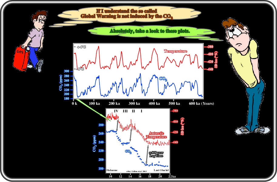
Plate 42- Al Gore used these curves, set up with the result of ice-cores taken from different parts of the world including Vostok (Antarctic), to show that the increase of CO2 in atmosphere (in blue) causes the increasing temperature of the Earth. In spite of the fact that the majority of the public believed Al Gore, all scientists know that correlation is not causation, and so, the advanced Al Gore conjecture must be able to resist valid testing, particularly when a lot of observations strongly suggest that the temperature variations precede the CO2 atmospheric variations with a lag-time ranging between 500 and 100 years. Just take a look at a close-up of these curves between 22 ky and today (lower diagram), it is evident that the temperature variations occur systematically ± 800 years before the CO2 variation, which Al Gore did not even mention. Additionally, Al Gore forgot to mention that in the diagrams: (i) The temperature variations, obtained by different "proxies" (isotopes of different gases), are ± 8°C (-440 of ∂Dice % corresponds roughly at -8°C and -380 to ± +4° C) and (ii) The rate of CO2 changed from 185 ppm to 265 ppm, i.e., 43%. If that is true, and as the rate of CO2 in the atmosphere increased by 40% (IPCC value) in the last century, then the temperature should have increased, at least, 7°C. Unfortunately, for him and his "Alarmists" friends, the increase in temperature was just 0.6°C, that is to say, 10 times less than predicted. All these observations refute the dogmatic hypothesis of the "Alarmists" that an increase in CO2 is responsible for the global warming. Alternatively, several scientists have advanced the hypothesis that the temperature variations are caused by a degasification of the oceans with a release of a portion of the dissolved CO2, as suggested by the lag-time between temperature and CO2 variations. In 1957, Revelle, R, and H E. Suess (Carbon Dioxide Exchange between Atmosphere and Ocean and the Question of an Increase of Atmospheric CO2 During the Past Decades; Tellus 9: 18-27) calculated that the rate of degasification of the oceans in CO2 was around 7% for a rising of temperature of 1° C. In conclusion: The curves shown by Al Gore not only do not corroborate the hypothesis that the rate of atmospheric CO2 is responsible for the rise in the global temperature, but they refute it as well.
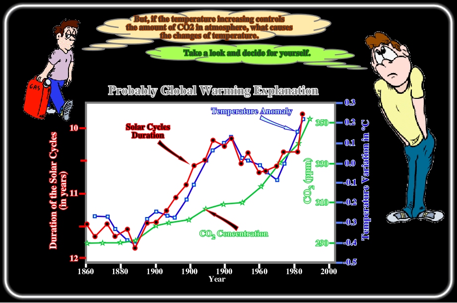
Plate 43- The superposition of temperature anomalies, solar cycles duration and CO2 variation curves, from 1860 till present time, depicted on this plate, strongly suggests a possible correlation between the temperature anomalies and the duration of the solar-cycles, but not between the temperature variations and the CO2 concentration. Since 1980, the CO2, in the atmosphere, progressively increased from ±290 ppm to ±350 ppm (in volume). Meanwhile, the average global temperature varied up and down. It was relatively low till 1885. Then, gradually, it climbed until 1945-1950 to decrease from 1950 till 1975. Since then, the temperature rose to reach a maximum in 2000. Obviously, the red (solar cycle duration) and the blue (temperature anomaly) curves follow variations nearly parallel. On the contrary, their pace is quite different from that of the green curve, i.e., the atmospheric CO2 concentration. In other words, this diagram strongly advocates that temperature is not CO2 dependent, but that it is probably related to the solar activity. Actually, the sun does not release its energy in a perfect constant way. Its radiation increases and decreases in a cyclic way more or less every eleven years. These cycles (Schwabe cycles) are related with the periodic occurrence of surface eruptions, which can be easily observed with the appropriate apparatus. Such eruptions induce huge magnetic field variations and emissions of particles toward all of the galaxy. Many scientist suspect that shorter is a solar cycle, then the longer is the solar instability. Such a correlation with the temperature is quite logical, since the sun is the unique source of energy heating the earth.
Plate 44- According to the Wikipedia Free Encyclopedia, the solar cycles were discovered in 1843 by S. H. Schwabe, who after 17 years of observations noticed a periodic variation in the average number of sunspots seen from year to year on the solar disk. Rudolf Wolf compiled and studied these and other observations reconstructing the cycles back to 1745, eventually pushing these reconstructions to the earliest observations of sunspots by Galileo and contemporaries in the early 17th century. Starting with Wolf, solar astronomers have found it useful to define a standard sunspot number index, which continues to be used today. The average duration of the sunspot cycles is about 11 years (about 28 cycles between 1699 and 2008), but it has been observed that cycles can be as short as 9 years and as long as 14 years. Significant variations in amplitude also occur. Solar maximums and solar minimums refer respectively to epochs of maximum and minimum sunspot counts. Individual sunspot cycles are partitioned from one minimum to the next. Following the numbering scheme established by Wolf, the 1755-1766 cycle is traditionally numbered "1". The period between 1645 and 1715, a time during which very few sunspots were observed, is a real feature, as opposed to an artefact due to missing data, and coincides with the Little Ice Age. This epoch is now known as the Maunder minimum, after E.W. Maunder, who extensively researched this peculiar event, first noted by G. Spörer. In the second half of the 19th century it was also noted (independently) by R. Carrington and by Spörer that as the cycle progresses, sunspots appear first at mid-latitudes, and then closer and closer to the equator until solar minimum is reached. This pattern is best visualized in the form of the so-called butterfly diagram, first constructed by the husband-wife team of E. Walter and A. Maunder in the early 20th century. Images of the sun are divided into latitudinal strips, and the monthly-averaged fractional surface of sunspots calculated. This is plotted vertically as a color-coded bar, and the process is repeated month after month to produce this time-latitude diagram (butterfly diagram).
to continue press
next
![]()
Send E-mail to carloscramez@gmail.com with questions or comments about this conference.
Copyright © 2000 CCramez
Last modification:
August, 2014